This time I am reviewing My Body is a Cage, a game by John Battle, with editing by Jared Sinclair, and seven accompanying 2-page dungeons written for the system by Alex Damanceno, Ema Acosta, Jim Gies, Josh Domanski, Maria Mison, Nevyn Holmes, and Julie-Anne Muñoz (who also illustrated several of the other dungeons). You can buy it as a PDF here or here for $20.
I play-tested My Body is a Cage over 3 short sessions (~2 hours each for a total of about 6 hours), running 3 players through “The Atkinson Hotel” by Ema Acosta, one of the 7 adventures included with the game. Two of my players, Nick Kuntz and Aleks Revzin, play in my long running dreamlands campaign. The third player was Bones’ own Anne, author of the Dungeon Dioramas series. Since this game is in some ways a crossover between indie and OSR sensibilities, it is worth saying that all three of my players had broadly OSR type expectations and preferred play styles. After the final session we spent a little while debriefing the game.
The Concept
John Battle says it best:
"Awake: You’re broke or struggling. Life is hard. You go to school and work a job, just trying to make enough for rent. Maybe you wanna be a youtuber, or draw your web-comic. Perhaps you want to travel, or at least move out of your parents’ house. You gotta find a way to make money. In this game you play as a person, someone other than yourself, in a slice-of-life story.
Dreaming: When you sleep you dream of a dungeon. It’s filled with treasure. If you steal it, you awaken richer. This is your chance to fight back against the struggle of life. But the dungeon holds dangers, and you are still just a person. So be careful. Good luck, don’t die."
Here at Ludic Dreams, I hope we can all agree: that's a great concept.
Char Gen and Gameplay Loop
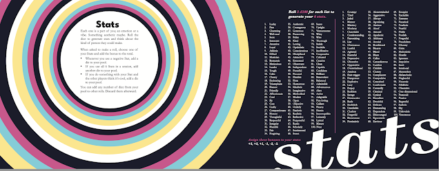
One neat thing about this use of stats is that it allows you to assign positive sounding adjectives to one of your penalty stats, and negative sounding adjectives to one of your bonus stats. For example, Anne played Stephanie, assigning the adjective “Cool” to the worst -3 stat position, deciding that Stephanie wanted so badly to look cool that it was a liability. Similarly, Nick assigned Fraudulent to the +3 stat for their PC Simone, on the rationale that Simone was a very compelling fraud.
The personality of the character takes shape from the assigning of stats and is further elaborated as you pick bonds that tie you to other PCs, select a flaw that your opponents can target, an ideal that you can voice once a game to your advantage, and two weirdly specific skills. You also roll once on a “genre” for your character, which can be a musical, cinematic, or literary genre that is somehow the theme of your character, which you can evoke one time per session to double your dice on some roll. Character generation caused us to laugh out loud several times. It created memorable PCs who were tied to one another in interesting ways. We all had a real sense of who the characters were before we started playing. I definitely recommend doing it together at your first session. I's fun to collectively watch the characters take shape and for people to play off one another.
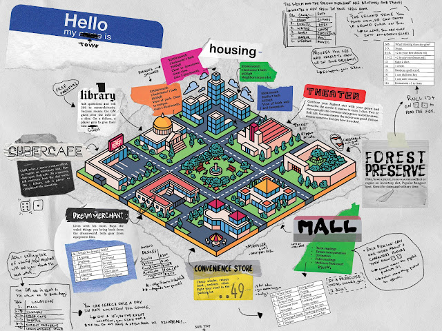
The game employs a loop perhaps influenced by the Persona series of games. (So Nick tells me, I haven’t ever played the games.) There is a daytime period that is charted out over a calendar month, with a daytime action available whenever the character has a day off (at least I think this is how it works). This is randomly determined as you have a 1 in 8 chance each day in the month to have a day off (oof, life is tough for the PCs). While the daytime system is never spelled out, there is a sample map of a waking world city that shows how the GM might construct daytime activities for their players.
After the daytime portion comes the nighttime portion set in the dream dungeon, which has an exploration turn based structure, familiar from old school games, and appropriate to a high peril environment. This phase is the more familiar “dungeon crawl”, although in a dreamy form. It is left open how these two phases relate. Perhaps the players decide how frequently they will enter the dream dungeons, allowing them to set their pace throughout the month under the pressure of making rent or tuition payments. Or perhaps the adventuring happens at set times, say every two weeks.
In our playtest, we used the waking world mainly to characterize the player’s relationships to one another and to an NPC who sent them into the dream dungeon. In other words, we focused mainly on the dream dungeon segment of play. This is too bad, because I think in an extended campaign the waking-dreaming loop would make for fun and dynamic play. The waking world portion would require probably the most investment from a GM, because Battle gives you a lot less to work with than in the dream dungeons. Battle does build some connections between the two phases by tying NPCs in the waking world to NPCs in the dream dungeon, with effects that can cross into the waking world in interesting ways. Were I running a campaign, I would probably develop more connections across the two cycles of play – including more ways to affect dreams by doing things in the waking world and vice versa. What would a rival adventuring party look like in a game like this?

The Atkinson Hotel and The Other Six Dungeons
The adventure we ran was "The Atkinson Hotel". It’s a very memorable location, a vaguely creepy turn of the (20th) century hotel, with an alarming staff and treasures from real world luminaries (e.g. Borges’ typerwriter, or a larger version of Duchamp’s painting The Bride) who used to frequent the hotel in their dreams, and may even have died there. I prepped for the dungeon for about 1 hour, mainly to flesh out the rooms and connections between a bit. Otherwise I was easily able to run the dungeon from the two-page spread. Two-page dungeons are hard to make work, but this dungeon is a masterclass in layout and design.
The three hotel staff NPCs are presented with brilliant lucidity: a tiny paragraph, three one line motivations or quirks, and a clever way to make a state block look interesting. They absolutely came alive in play with almost no effort. Check out the list of treasures at the bottom of the dungeon as well! I always love memorable treasures and the idea of using heirlooms from literary and artistic luminaries in the waking world is a gorgeous premise.
The dungeon itself is a pointcrawl between eight hotel rooms. The starting room is very dynamic with three different exits, one normal (hotel room door) and two surreal (at the back of the closet, under the bed). In our playthrough, the players reported the dreamlike quality of the dungeon came through strongly. There were some memorable moments that emerged in play, including the surreal experience of climbing out of a small and claustrophobic (indeed shrinking!) storage room into a huge storage room surrounding it. Another memorable moment involved Aleks’ character Alecs waking the perennially sleepy hag he carries on his back (random “equipment” he started with) with the tempting smell of soup, and setting her off into kitchen to taste all the soups to the hysterical consternation of the bustling chefs in the room. A final memorable moment came when Stephanie shot the infernal title to Borges’ typewriter out of the hands of the hotel manager with her bow, sticking it to the wall, right before the PCs made their getaway back to the waking world, Borges' typewriter in hand.
The players liked the dungeon on the whole, although they did feel limited by its linear pointcrawl nature. Although you can get on the crawl 3 different ways from the first room, each other room has one entrance and one exit, meaning that once you made your initial selection you are always on a linear path. Were I revising the dungeon I would Jaquays it by introducing maybe 4 extra rooms, looping paths, and multiple exits from most rooms.
They had a deeper criticism which comes from what I think as the "dream aesthetic dilemma". In dreams, scenes are often disconnected, spatial logics break down, and "people" often function more as symbols than living beings with their own distinct agendas. Old school dungeons by contrast work on spatial logics. One explores the space, learns to navigate it, and works it to one's advantage. The people one encounters are not figments or parts of tableaus, but factions with their own agendas and desires, who occupy regions on the map or move through it in intelligible ways. This (fantastic) naturalism enables lateral thinking, problem solving, and open-ended negotiation. The dilemma is that the absurdist, disconnected, symbolist aesthetic of dreams pushes against this. (As you might imagine, I of all people have thoughts about ways to navigate this dilemma, but I'll save those for another time.)
It's not surprising that my (OSR style) players remarked that there clearly was no map of an actual hotel, but only dream scenes snipped from a hotel and connected by pseudo spatial connectors. They had the sense that each was a static scene that would stay where it was when they closed the door. They noted that this limited their sense of agency, which depends on the logic of real world space, and made the dungeon less interactive than more “naturalistic” dungeons. For some of the NPCs, they also wondered how much "they were really people".
Still, I think this is an excellent starting dungeon for this game. I would wholeheartedly recommend a less linear, properly Jaquaysed version of it as a near ideal introduction to My Body is a Cage.
 |
| Behold the Nyxosphere in all its glory! |
In a second tier we have two dungeons that have excellent material but need some work. The first is “The Desert”, a depth crawl by Josh Domanski. It’s evocative and interesting. It uses a nice mechanic of randomly generated locations + details + events, with modifiers for depth. But the different locations don’t give you quite enough information to make them interactive and playable, and there is no treasure even listed. The second is “Seasons Amiss” by Nevon Holmes, illustrated by Julie-Anne Muñoz. This “dungeon” has an amazing concept. It consists of a pointcrawl across a surreal map. At the starting place there is a lantern that can be turned to red or blue light, shifting the whole map into summer or winter phases. Certain things are revealed in each phase, given the map a wonderful interactivity and puzzle solving vibe. Excellently, the two lights also introduce countdown clocks to environmental hazards in the form of heat waves or blizzards that will punish the players and keep them moving. While I adore the concept of the dungeon, it contains no encounters, no monsters or NPCs, and no treasure.
In the third tier, we have dungeons that work less well. "Stiff Bargains", another team-up by Nevyn Holmes and Julie-Anne Muñoz, consists of a punny series of fetch quests for absurd NPCs. The whole is alarming and absurd enough that it could be fun for a certain group. But the linked chain of fetch quests is not the best format for a dungeon crawl. The last adventure I hesitate even to speak about. It is called “The Seven Orifices of Omniscience”. It is not clear who wrote it or what it is. It reads like something from the Book of Revelations. It is in no way a dungeon.
Let’s talk about the innovative mechanics of the game. The games core mechanic is that when your character does something, a GM or another player can ask you to roll. You choose one of your attributes to roll on and apply the modifier to a 2d6 roll. If the roll is unopposed you must roll a 10+ to succeed. If the roll is opposed then the GM or other player rolls 2d6 as well, perhaps adding a modifier. Whoever rolls higher gets to say how the thing turns to their advantage, and the loser can choose to up the stakes and try again if they want. Combat uses opposed rolls but works a little differently. I’ll talk about that below.
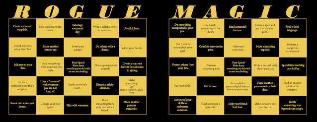
You can add extra dice to your rolls in a number of ways, including most importantly from a dice pool that functions as a kind of meta-currency. You are incentivized to employ negative attributes because whenever you roll an attribute with a penalty you add a die to the pool. You also add dice to your pool if you use all six attributes over the course of the adventure. Most importantly, you add dice to your pool by selecting a bingo card that corresponds to a class for each session (both daytime and dream dungeon). The bingo card incentivizes playing to the type of the relevant character class. You get a die each time you cross off something on the bingo card. You get a whopping 10 dice if you get bingo by completing a row, column, or diagonal. At the end of an adventure, unused dice in your pool can be converted to treasure or used to buy skills, bonds, or a chance to raise an attribute. This flexible use of the meta-currency is interesting.
The players in this game had mixed feelings about the meta-currency aspect of the game. On the one hand, they experienced the core mechanic as straightforward and intuitive. Since near certain failure (rolling to hit 10+ with an attribute penalty) is incentivized by the meta-currency, and since adding dice nearly always ensures success even on opposed roles, the players experienced themselves as often choosing between failure and success. They found this a little strange. But this is also a game where you play to win in high peril circumstances (dungeons). This meant that they were incentivized to choose strategically to fail in low stakes situations in the service of collecting rewards (dice saved as treasure or XP style rewards) or storing up meta-currency ammo to win in higher stakes circumstances. This “failing in order to win” dynamic felt unfamiliar to them and they didn't entirely love it.
There was also a lot to keep track of on the character sheet in terms of the meta-game currency, including attribute modifiers, dice pools, a few other ways of boosting dice (genre, bond, skill), and the massive bingo card. As OSR players used to assuming that “the answer is not on your character sheet”, they found the meta-currency worked against this expectation. Since the meta-game currency dominates the players strategic experience, the players reported feeling like the answer to pretty much everything really was on their character sheet.
Core Mechanics
Let’s talk about the innovative mechanics of the game. The games core mechanic is that when your character does something, a GM or another player can ask you to roll. You choose one of your attributes to roll on and apply the modifier to a 2d6 roll. If the roll is unopposed you must roll a 10+ to succeed. If the roll is opposed then the GM or other player rolls 2d6 as well, perhaps adding a modifier. Whoever rolls higher gets to say how the thing turns to their advantage, and the loser can choose to up the stakes and try again if they want. Combat uses opposed rolls but works a little differently. I’ll talk about that below.
You can add extra dice to your rolls in a number of ways, including most importantly from a dice pool that functions as a kind of meta-currency. You are incentivized to employ negative attributes because whenever you roll an attribute with a penalty you add a die to the pool. You also add dice to your pool if you use all six attributes over the course of the adventure. Most importantly, you add dice to your pool by selecting a bingo card that corresponds to a class for each session (both daytime and dream dungeon). The bingo card incentivizes playing to the type of the relevant character class. You get a die each time you cross off something on the bingo card. You get a whopping 10 dice if you get bingo by completing a row, column, or diagonal. At the end of an adventure, unused dice in your pool can be converted to treasure or used to buy skills, bonds, or a chance to raise an attribute. This flexible use of the meta-currency is interesting.
The players in this game had mixed feelings about the meta-currency aspect of the game. On the one hand, they experienced the core mechanic as straightforward and intuitive. Since near certain failure (rolling to hit 10+ with an attribute penalty) is incentivized by the meta-currency, and since adding dice nearly always ensures success even on opposed roles, the players experienced themselves as often choosing between failure and success. They found this a little strange. But this is also a game where you play to win in high peril circumstances (dungeons). This meant that they were incentivized to choose strategically to fail in low stakes situations in the service of collecting rewards (dice saved as treasure or XP style rewards) or storing up meta-currency ammo to win in higher stakes circumstances. This “failing in order to win” dynamic felt unfamiliar to them and they didn't entirely love it.
There was also a lot to keep track of on the character sheet in terms of the meta-game currency, including attribute modifiers, dice pools, a few other ways of boosting dice (genre, bond, skill), and the massive bingo card. As OSR players used to assuming that “the answer is not on your character sheet”, they found the meta-currency worked against this expectation. Since the meta-game currency dominates the players strategic experience, the players reported feeling like the answer to pretty much everything really was on their character sheet.
One of the players in particular wished that more of their attributes were relevant to the kinds of physical actions on performs in a dungeon, which is a very physical space. Sometimes that reported that it felt like a stretch to find an appropriate attribute, most of which refer to personality traits, to roll on for physical tasks.
None of this is to suggest that the meta-currency core mechanics don’t work. But the mechanics do perhaps push towards a different playstyle than old school play. If you are open to a fusion of indie and OSR styles, then I think you may like this. If you are more solidly OSR in your preferences, you may find some of the mechanics a stretch.
Combat
In combat, one uses opposed rolls with the winner scoring a hit against the loser. Damage is recorded by marking off inventory slots and sometime incurring conditions like burning or bleeding that also occupy inventory slots. The use of inventory slots as hit points is elegant. Having conditions occupy inventory slots--as Mausritter does--created an elegant unified mechanic. I especially enjoyed the robust role for conditions in the system, although we didn’t see this in our play test, which had little combat. For example, the condition of burning spreads to additional inventory slots until the fire is put out, and if you are stressed you lose 1 die from all your actions (!), but you can pass to other players, presumably by unloading it on them.
The application of this system to monsters works elegantly too. Monster have inventory slots corresponding to their HD. These slots contain their various attacks or abilities, so you incapacitate your foe as you score hits against them. For example, if you can score enough hits against a giant lobster you might break its claw.
My Body is a Cage also uses a lower-is-better initiative system that has you roll different sized dice depending on how time consuming or slow what you’re doing is. You can do up to 3 things in a single round, but you have to roll all 3 initiative dice if you do. So there's an economy between going first, or doing more things in each round.
I found opposed rolls a strange fit with the otherwise innovative individual initiative system. Opposed rolls represent a struggle as a two-sided affair, combining the activity of both sides in a single dramatic face-off roll. But the individual initiative system seems more geared to representing attacks as one-directional affairs, where each participant gets their own separate actions that are resolved in sequence. If I’m understanding the system, then if someone is facing multiple foes, they get a very large number of attacks each round in the form of opposed rolls: each of their opponent’s attacks trigger an opposed roll (up to 3 attacks each), and on top of that, opposed rolls are also triggered by their own actions (again up to 3).
In play I stumbled over this system, only coming to the above understanding by the time I was done running it. I started out thinking that there was only 1 opposed roll per pair of combatants, but then realized that this didn’t work with the individualized initiative system and multiple actions a round. It was a little strange that I walked away from reading the brief rules about combat so unsure about how they were supposed to work. Maybe if Battle had said a little bit more, it would have been clearer to me from the start.
Graphic and Information Design
This brings us to questions of design. My Body is a Cage is laid out in landscape orientation. Each page or two-page spread is colorful and uniquely designed, focused on a single idea or rule. Sometimes there’s a paragraph of text, or a big table, and sometimes there’s just a few sentences.
If you love this kind of thing you’ll probably like this a lot, and if you hate it then you probably won’t like it here either. Personally I’m agnostic about this trend in graphic design. I did find that it worked in one specific way for me here. Many of the rules and ways of tracking things used in My Body is a Cage have a gimmicky toy-like feel. Each character has a bingo card that you print out and mark up in play. There is a word search you complete to get random starting equipment. You stack dice in a little circle on your character sheet to represent your dice pool. There’s a paper fortune teller that the GM cuts out and assembles to determine random treasure. The bright and splashy layout made it feel like the game was composed of activities drawn from a colorful children’s activity book—the kind you might have bought in a convenience store before getting on a long family trip or bus ride. While it won’t come across quite as clearly in online play as it would in person, with a little prep it and having players print out sheets in advance, I think you can capture a fair bit of this activity book vibe.
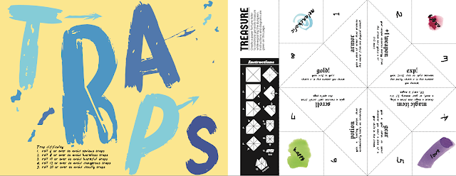
This is an ambitious design choice that was relatively well-realized. Some of these features could use a little fine-tuning. The character sheet presupposes you will record your dice pool by stacking dice, and the bingo card seems to presuppose you will use tokens, since there's no way to mark off a black square with a pen. We found this awkward for purposes of storage when an adventure was spread out over multiple session, as they often will be. (Skills are also missing from the character sheet, by the way.) But the basic thing I want to say is that it's impressive how well John Battle pulls off this tactile, festive, childlike feel in the design. The aesthetics of the graphic design have a real point that fuses with the rules for the game in interesting ways.
When it came to information presentation the design of the book does less well. The book wastes no words on explaining how the rules work in play or even fit together, often assuming you’ll sort of infer the logic of the game from the different terse but colorful rules spreads. I found this frustrating. I spent far more time trying to understand the game than I would have had there been more text to help me. Not all minimalism is sleek information design; sometimes less is actually less.
Exacerbating this problem, there are several things that seem to be implied by the rules but do not otherwise appear in the game. For example, the initiative system is geared around weapons of different size, but there are no mechanical effects for different sized weapons. Another thing is the selection of character class for each session. The only mechanic presented is the bingo sheet that incentivizes certain kinds of behavior for each class by adding to your dice pool when you check off the box. But the game includes a list of spells that you’re supposed to dice for. Do you get a spell if you took the magic bingo card? But do you also get something if you take the fighter or rogue bingo card? Maybe one of those weapons of different size?

The premise of this game was very attractive to me, but I wasn't in love with the mechanical execution, even just on the player side.
ReplyDeleteThe use of dice in MBIAC almost feels like a vestige, something left over from the fact that it's inspired in some way by D&D. Because as you mentioned, the way the odds of success work, there doesn't FEEL like there's much of a gambling component to rolling the dice. It mostly feels like a foregone conclusion based on the decisions you made before you rolled, and then the dice just confirm what you already knew was going to happen.
On a 2d6, you've got a 17% chance of rolling a 10 or higher. With a - modifier, it becomes either essentially or literally impossible, but you DO get a token to spend out of it. On a 4d6, you've got a 90% chance, and with a + modifier, again, it becomes difficult or impossible to fail. So it really felt like we were deciding to succeed or fail based on how many tokens we spent (that is, how many dice we pulled out of our Dice Pool) - the actual rolling of the dice just confirmed what we'd already decided.
Plus you also earn tokens for roleplaying, and during the session, the ONLY way to lose them is to spend them to add more dice to a roll. Seeing this mechanic in action made me think that you might as well eliminate the dice and just base success and failure on an economy of tokens. That is, in effect, mostly what we were doing anyway, and eliminating the dice would get rid of the illusion that the element of chance was an important determinant of what happened in the session. It would be more honest about how things are actually decided.
I also think that ideally, this wants to be a game where you make decisions about which stat to use based on roleplaying considerations. So like, I decide if I'm acting coolly or lazily or whatever based on the type of person I'm portraying and how I think they would feel about the situation. But if the potential connection between the stat and the action is tenuous or unclear, then there's no good way to decide that way, and it's really tempting to decide based on mechanical considerations, like, do I want a + or a - on the roll, and how big? And so that's not just a bit awkward, it's a mechanic that actively works against desired player experience.